
Software
yampex
Yet Another Matplotlib Extension, with simplified subplotting
The Python 3 package yampex makes Matplotlib easier to use, especially with subplots and annotations. You simply construct a Plotter object with the number of subplot rows and columns you want, and do a context call on it to get a version of the object that’s all set up to do your subplots. Like this:
import numpy as np
from yampex import Plotter

funcNames = ('sin', 'cos')
X = np.linspace(0, 4*np.pi, 200)
pt = Plotter(1, 2, width=7, height=5)
pt.set_title("Sin and Cosine")
pt.set_xlabel("X"); pt.set_grid()
with pt as p:
    for funcName in funcNames:
        if funcName == 'sin':
            p.add_line(':')
        p.set_ylabel("{}(X)".format(funcName))
        Y = getattr(np, funcName)(X)
        p(X, Y)
pt.show()
The Plotter instance pt has various methods for setting plot
modes. The example calls two of them before it makes the context call,
thus affecting all subplots that are to be produced. It calls
pt.set_xlabel("X") to make the x-axis label “X” and calls
pt.set_grid() to include a grid, for all subplots.
Then the example code does a context call on the pt object to obtain
a contextualized instance of it, p. Everything done to this
contextualized instance applies to just one subplot rather than all
subplots. So, when the example calls p.set_ylabel with a
string-formatted argument, it sets the y-axis label of just one
subplot at a time, based on the value of funcName.
The actual subplotting is done with a call to the p context object
itself (not a method of it). The first argument is the x-axis vector
X, and all arguments that follow are y-axis vectors plotted against
the x-axis vector. In the example, there’s just one y-axis vector,
Y. You can supply additional vectors to be plotted against the first
x-axis one and they will show up in different colors.1
Once the p object has been called, the context switches to the next
subplot. In the example, there are two subplots, one above the
other. The second iteration of the for loop sets the second
subplot’s y-axis label to “cos” and plots a cosine.
The end result of the example will look like this:
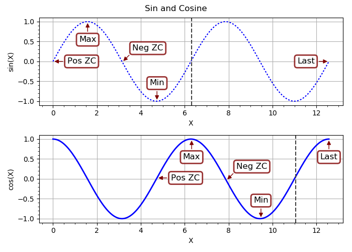
Notice that p.add_line was called for the first (top) subplot–to
give it a dotted linestyle–but not for the second. The linestyle
reverted to its solid default when the p object was called a second
time for the bottom subplot. Each call to p inside the context gets
a fresh start with the options that were set before (outside) the
context.
Annotations
Another thing that yampex can do for you is to annotate your plots
with intelligently-positioned labels. You don’t have to worry about
whether your annotation graphic will obscure part of the plot line, or
sit on top of the plot borders looking ugly and weird. And adding the
annotations is as simple as calling the add_annotation method of
your plotter object. You make the call outside the with-as context
if you want to add the annotation to all subplots, or in context to
affect just one subplot.
Let’s expand the example to add annotations to the sine and cosine curves.
import numpy as np
from yampex import Plotter

funcNames = ('sin', 'cos')
X = np.linspace(0, 4*np.pi, 200)
pt = Plotter(1, 2, width=7, height=5)
pt.set_title("Sin and Cosine")
pt.set_xlabel("X"); pt.set_grid()
pt.add_annotation(199, "Last")
with pt as p:
    for funcName in funcNames:
        Y = getattr(np, funcName)(X)
        p.set_ylabel("{}(X)".format(funcName))
        k = 0 if funcName == 'sin' else 75
        for text in ("Pos ZC", "Max", "Neg ZC", "Min"):
            p.add_annotation(k, text)
            k += 25
        p.set_axvline(k)
        p(X, Y)
pt.show()
First we add a global annotation to the overall Matplotlib-manager
object pt that affects all subplots; the last point plotted is
labeled “Last.” Then we enter the context manager and, via the
contextualized object p, add annotations to each subplot for a
positive zero crossing. The annotations are a maximum, a negative zero
crossing, and a minimum. Here’s the result:
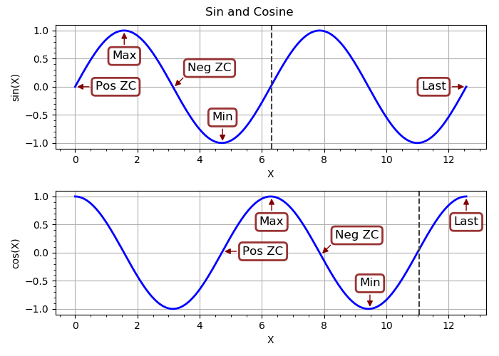
Note how the annotation boxes are positioned so that they don’t cover
up the plots or each other, or trespass on the borders. A surprisingly
large amount of thought and computation went into making that
happen. If you’re interested, you can check out the gory
details
of the Annotator class and its Sizer, RectangleRegion, and
PositionEvaluator helpers. (This module is also, I submit, a fine
example of the elegance and power of object-oriented programming.)
A couple of other things you might notice: There’s a dashed vertical
line at the zero crossing after the last annotation. That was added by
calling p.set_axvline(k). Take a look at the methods of
OptsBase to see
all the options you can set. Another one that the example code has set
(on a global scale, before entering the context manager) was the title
for all subplots. You could just as easily set a different title for
each subplot inside the context manager.
A Complex Example
Here is a more complex example of an annotated plot, with four different-sized subplots. The curves and annotations were chosen to illustrate how yampex rises to the challenge of figuring out where to put the annotation text boxes without having them overlap either of the plotted lines, the subplot borders, or each other.
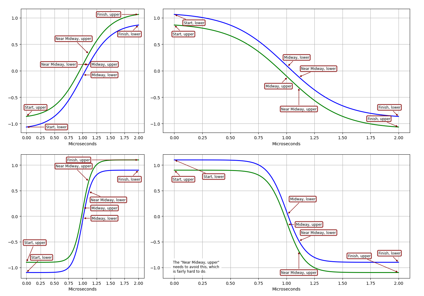
There’s a lot going on here. Click on the plot for a high-definition version and you can appreciate all the details. Imagine how your plots will look, and how much easier it will be to generate them in your own Python code! I wrote yampex for my own use, and will probably never produce Matplotlib plots without it.
Running the Examples
After installing yampex with pip install yampex, you should have a
new command added to your path, yampex-examples. You can just run
that from the shell as a regular user and it will generate a
subdirectory ~/yampex-examples with some example files that can be
run to generate plots. For example, you can generate the plot by
typing ./annotate.py in a shell from that subdirectory. Take a look
at how small that file is. Here’s all the Python it contains:
import numpy as np
from yampex import plot, annotate
from yampex.util import sub

class Figure(object):
    verbose = False
    multipliers = (1, 3)

    def __init__(self):
        # DEBUG: Set True to see positioning rectangles
        if self.verbose:
            annotate.Annotator.verbose = True
        self.p = plot.Plotter(
            2*len(self.multipliers),
            verbose=self.verbose, width=1500, height=1000, w2=1)
        self.p.use_timex()
        self.p.use_grid()

    def add_annotations(self, k, prefix):
        for kVector in (0, 1):
            text = sub("{}, {}", prefix, "upper" if kVector else "lower")
            self.sp.add_annotation(k, text, kVector=kVector)

    def plot(self):
        def tb(text):
            self.sp.add_textBox('SW', text)

        X = np.linspace(0, 2e-6, 100)
        with self.p as self.sp:
            for m in self.multipliers:
                Y = np.tanh(m*2e6*(X-1e-6))
                for sign in (+1, -1):
                    self.add_annotations(0, "Start")
                    self.add_annotations(50, "Midway")
                    self.add_annotations(55, "Near Midway")
                    self.add_annotations(99, "Finish")
                    if self.sp.Nsp == 3:
                        tb("The \"Near Midway, upper\"")
                        tb("needs to avoid this, which")
                        tb("is fairly hard to do.")
                    self.sp(X, sign*(Y-0.1), sign*(Y+0.1))
        self.p.show()

def run():
    # Plot the curves
    Figure().plot()

if __name__ == '__main__':
    run()
That’s it!
You can modify any of these example files to learn how to use
yampex, and your modifications will not be overwritten if you run
yampex-examples again. To get the original example file, just delete
the modified one and run yampex-examples, and the original will be
copied.
The simplest example of all is to try out the package-level xy
function. You can do that without installing any other examples. It
provides ultra-simple XY plotting of a numerical sequence or Numpy
vector, or a pair of Numpy vectors. Here is all you have to do in
ipython or the Python console to try it:
In [1]: from yampex import xy
In [2]: xy([0,1,2,1,0,-1,-2,-1,0])
With these two lines you get a sawtooth waveform. It’s a very handy little function when you’re trying to get a quick visualization of vectors in Python. If you want to plot to equal-length vectors against each other, just include them both as arguments.
Happy plotting!
License
Copyright (C) 2017-2021 by Edwin A. Suominen, http://edsuom.com/:
See edsuom.com for API documentation as well as information about
Ed's background and other projects, software and otherwise.

Licensed under the Apache License, Version 2.0 (the "License");
you may not use this file except in compliance with the
License. You may obtain a copy of the License at

  http://www.apache.org/licenses/LICENSE-2.0

Unless required by applicable law or agreed to in writing,
software distributed under the License is distributed on an "AS
IS" BASIS, WITHOUT WARRANTIES OR CONDITIONS OF ANY KIND, either
express or implied. See the License for the specific language
governing permissions and limitations under the License.
Notes
-
You can also supply a single vector with just one argument. Then that vector will be plotted with the vector integer indices as the x-axis. ←